I continue to futz around with the data from the Metadata MOOC.
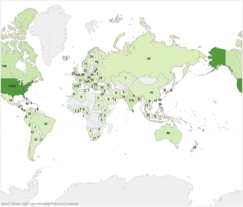
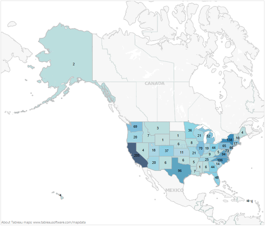
About 2 weeks ago, I was interviewed for this story in the UNC University Gazette. (It’s a good story, you should read it. And not because I’m quoted… honestly, Don Hornstein said much more intelligent things than I did.) Anyway, one of the questions the reporter asked me was: What was the breakdown of countries the students were in? And, somewhat to my embarrassment, I couldn’t answer the question. We have that data; I just hadn’t run the numbers. So I wanted to actually answer that question. Plus, it gave me an excuse to use the map view in Tableau.
On the pre-course survey, we asked the following questions:
- In which country do you reside?
- If you answered that you live in the United States, in which state or territory do you reside?
Now, I have to warn you, I consider this kind of self-reported data to be extremely suspect. I have a friend who, when online services asked him to create a profile, always used to represent himself as a 14-year-old girl from Bolivia. (Probably best not to speculate about what that says about this particular friend.) Point is, some people are going to misrepresent personal data about themselves. (Though I don’t see what the motivation would be for a Coursera student to do that, especially not on a course survey, given that they’ve already created a profile with Coursera. Not that we cross-checked. But still.) Furthermore, even if we assume that all Coursera students are fundamentally honest, these questions were asked as drop-down menus, and there are what, on the order of 200 countries in the world? It would be very easy for someone’s mouse to slip, and accidentally select the wrong country.
For these reasons I am extremely skeptical about all forms of self-reported data from surveys. That said, though, this data about enrollment around the world corresponds to other MOOC enrollment data I’ve seen. Where are most of the students? In the US, and to the tune of almost an order of magnitude more than in any other country. Canada comes in a distant second, followed by India and Europe. I did well in Australia. Brazil puts in a good showing, as does Russia. China, not so much: so much for the BRIC countries. I’m also not big in Japan.
It’s equally interesting to see what countries aren’t represented. The obvious voids are in Africa… though there are more nations represented in equatorial Africa than I’d have expected. There’s another gap in the ‘Stans. Southeast Asia is spotty. And I get no love from Greenland… though that hardly counts, as the population of Greenland is even less than that of North Dakota, where I also get no love.
It makes sense which states are best represented here: California, New York, North Carolina, Texas, Virginia… all states with large populations and at least one Information Science program each. (CA, NC, & TX have several.) Though I haven’t yet looked to see who in these states took the course: do they work in the field, are they in an academic program in the field? Or are there just a lot of Californians who have a general interest in metadata? Maybe that’ll be my next analysis.


1 Comment
Sachin Surana
Hi,
I am one of the Coursera students but missed this very interesting and relevant course.
1. I wonder if the course videos could be made available as “preview lectures” to Coursera students at large. That would really be beneficial for students who missed the course. There are quite a few courses where videos are accessible even after the course has ended.
2. When do you plan to run the second session of the course?
Regards,
Sachin